N°03 1% Club · Credit card trackingPersonal finance · 2026

Knowing what you owe on every card

1% Club showed people their bank balance and bank spends, but not their credit cards. I designed credit card tracking: with permission, the app reads the bank emails about your cards and shows, for each card, how much you owe, when it’s due and how much of the limit you’ve used.

  1. The problem

    The app showed what people own, but not what they owe on cards. Their money picture was only half true.

  2. The hard part

    The only source with both bills and spends is email, and email is always a little behind. Most of the design was deciding what to show when the data isn’t there yet.

  3. Where it is

    Designed end to end and handed over to engineering. Still being built and tested internally.

My role
Product designer, end to end: research, flows, the wallet, card details, error states and motion. The design calls on this page were mine; the data source and scope were set with product and engineering
Worked with
Product and engineering in the Personal Finance team at 1% Club
Data
No launch results and no usability testing yet. Every number on the screens and in these visuals is an example
N°01 The problemWhy cards

People came looking for their cards. The app had nothing to tell them.

1% Club helps people work out when they can stop working. That answer depends on net worth, and net worth left out every card. A credit card tab already existed, but it only knew a card’s fees and benefits.

Out of every 100 people who open the app
Nearly 40

find their way to the credit card tab.

Fewer than 2

do anything there. They arrive, look around, and leave.

The interest was real. The tab just couldn’t answer the one question people brought with them: what do I owe? Mixpanel, credit card adoption board · rounded

Illustrative · as of 13 Oct
Net worth, after what you owe on cards₹16.71L
₹1.64L owed on 4 cards
Investments and bank
₹18.35L
Card dues
− ₹1.64L
Net worth
₹16.71L
Money tab: net worth, cash flow, bank balance and a Credit cards row with Add
Decision · where it lives

Credit cards sit in the Money tab, under bank accounts

The problemCards had their own corner of the app and a shortcut on Home, about fees and rewards. Nothing connected them to the rest of your money.

The callCards moved into the Money tab, under bank accounts, and the Home shortcut went. What you owe now sits next to the balance it will be paid from, in the one place people already go to check their money.

Trade-offOne way in is easier to find and to measure, but people who used the Home shortcut lose it.

N°02 How card money worksThe domain

Before designing anything, I learned how card billing actually works.

Every number has to match a bank statement to the rupee. These facts shaped most of the later decisions.

A bill’s life · drag along the timeline

One card, two clocks, and a due label that changes every day

Calendar monthBilling cycleThis bill
SeptemberOctoberNovember
…14 Sep – 13 Oct · bill ₹42,00014 Oct – 13 Nov · next cycle
Time to pay · 20 daysGraceLate fee
Statement · 13 OctDue · 2 NovNext statement · 13 Nov
22 Oct
On this day, the card saysDue in 11 days

01Two clocks

A bill covers the 14th to the 13th and is due weeks later. People budget and get paid by calendar month. The two never line up.

02Late isn’t late on day one

Late fees and credit-report marks start only after a bill is more than three days overdue.

0330% is guidance, not a rule

Credit bureaus suggest keeping usage under 30%, and some say 40%. No regulator sets it, so the app treats it as a guideline.

04Refunds change the bill

A refund before the due date lowers what you owe. The amount due can move after the statement.

N°03 Getting the dataWhy email

Only bank emails had both the bill and the spends.

We compared every way to get card data before committing, because the source decides what the design can promise. Email won, and it’s always a little behind: statements arrive on the bank’s schedule, spends show up days later and some files come locked with a password.

Bank emailsBill fetchSMSBank accountsCredit reportAdding by hand
You owe
You spent
ChosenLaterRuled outNo cardsCards onlyFallback
N°04 Adding cardsEarning the inbox

Asking for someone’s inbox has to be earned, one screen at a time.

When we ask for the inbox

Card first puts two steps of value before the ask

Chosen · card first
  1. 1Pick your cards
  2. 2See which can be tracked
  3. AskConnect email
  4. 4Find statements
  5. 5Review and track
Not chosen · email first
  1. AskConnect email
  2. 2Find every card
  3. 3See your cards
  4. 4Pick the ones to track
  5. 5Track
Value before the askThe permission
The add flow · seven screens

One permission, asked at the right moment

The problemEach step of connecting a card can lose people, and the riskiest one is the inbox permission. Ask too early and people say no. Ask too late and they’ve already done work for nothing.

The callPick your cards, see them added, then connect email for the ones we can track. The search runs while people are free to leave, and the review screen hands control back before anything is tracked.

Trade-offSeven screens is a long flow. Each one answers a single worry, so none of them can be cut without bringing that worry back.

No silent trackingFound cards aren’t pre-ticked

When a search finds more cards than someone picked, they choose each one. A card someone forgot about is never tracked silently.

Free to leaveFree to leave after 15 seconds

The search usually takes 5 to 10 seconds. If it runs longer, Back to dashboard appears, and a notification says when the cards are ready.

Any number of cardsOne locked card never blocks the rest

On the review screen, cards that need a password or a limit go on top and ready ones fold into one row. Track cards always works.

Freshness on every numberEvery number says how old it is

“Updated 2 hours ago” sits under every card. Email arrives late, so freshness is part of the number, not a footnote.

Privacy · what happens to the inbox

Read-only, bank emails only, and easy to undo

What’s read

Only statements and spend alerts from known bank senders that pass email checks. Personal emails are never read, and nothing is ever sent.

What’s kept

The card’s statements and spends, encrypted. A statement password is saved only to open that card’s future statements.

Asking again

A new card found later is only suggested. It’s tracked only after the person agrees, and a removed card is never suggested again.

Stopping

Pause or remove any card from card settings, or revoke access from the Google or Microsoft account. Removing a card deletes the card and its data.

N°05 The walletMany cards

With eight cards, which one needs you?

A design review called the first card list too information-heavy: with five to eight cards, the carousel showed about one and a half. The brief became three or four facts per card and quiet colour, and the answer was to stop adding to each card.

One card, every state · in priority order

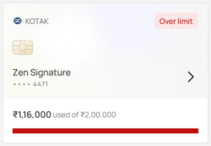
If a card has more than one thing to say, the most urgent wins

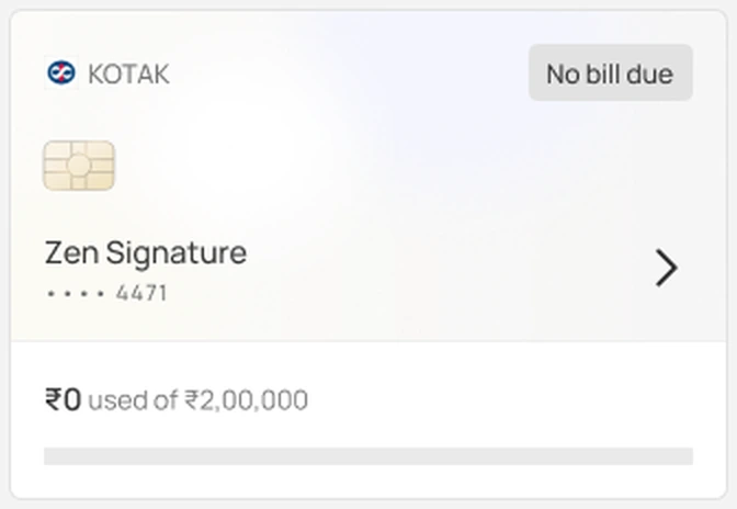
Wallet card: Needs something from youWallet card: OverdueWallet card: Over the limitWallet card: Due within a weekWallet card: Above 30% usedWallet card: PaidWallet card: No bill this cycleWallet card: Fetching

We found the statement but the bank locked it. One line says what to do, and the card stays the same size.

The card from the hand-off, in each state

Your card wallet: a total on top, a card switcher and one card with its status
The card list

Same size, no buttons, named not numbered

The problemEarlier cards came in three heights, carried buttons, and showed an empty bar when there was no data. I also chose names over the last four digits, because that’s how cards are sold and talked about.

The callEvery state fits one card size. Tapping the card is the action and lands on the fix. Cards without numbers show no bar. Long card names get a short label automatically.

Trade-offNo buttons means every status has to lead to the right screen.

N°06 Card detailsOne card

Each card answers three questions: what do I owe, by when, and am I using too much?

Banks talk in statements and billing cycles. Most of this screen was rewriting bank terms as the questions people actually ask.

Bank termWhat people askWhat we show
Total amount dueHow much do I owe?Current outstanding, shown first
Billed and unbilledIs this on my bill yet?One bar, split into billed and not yet billed
Billing cycle, 14 Aug to 13 SepWhat did I spend this month?A switch between billing cycles and calendar months, and no invented monthly numbers
Credit utilisationAm I using too much?The share of your limit used, with a line on the 30% guideline
Payment receivedDid my payment go through?“Paid, to be confirmed” until the next statement shows it
Credit utilisation: limit used, billed and unbilled, and the bill with Mark as paid
Credit utilisation

What you owe, then limit used, then the bill

The problemThe first version showed nearly the same amount three times. A reviewer also asked why the bill didn’t come first, as in payment apps.

The callOne order, the one people already read a statement in: what you owe, how much of the limit that is, then the bill with Mark as paid. This version is about knowing your usage, so the bill comes second.

Trade-offNo pay button yet. People still leave the app to pay.

Category breakdown: a Spends and Incoming switch, then spends by category with share and amount
Category breakdown

Where the money went, in categories people already know

The problemA card’s spends needed a breakdown of their own, but the Money tab already sorts bank spending into categories.

The callThe same categories as bank cash flow. A switch between Spends and Incoming, where Incoming holds refunds, cashbacks and reversals. Bill payments are left out, so paying the card never counts as spending.

Trade-offMerchants paid by UPI arrive as UPI IDs, so some spends will land in the wrong category. A category can be changed, for past and future spends at that merchant.

Mark as paid

Believe the person, let the statement confirm

The problemWe only learn about a payment from the next statement, weeks later. Meanwhile reminders keep coming for a bill that’s already paid, and a card bill can be paid in part, down to the minimum due, so “paid” isn’t always all of it.

The callMark as paid asks how much: the full amount or another amount. Reminders stop at once, and the card says “Paid, to be confirmed” until the next statement agrees. If it doesn’t, the card says so and asks people to check with their bank.

Trade-offFor a few weeks the app shows a payment it can’t verify yet. It says so in the label.

N°07 When it breaksEdge cases

Old numbers keep their place. They just say how old they are.

When a connection breaks, the instinct is an error screen. But the last statement is still true, and hiding it takes away the one thing people came for.

Pause before remove

Offer the smaller step first

The problemRemoving a card deletes months of statements, spends and insights, and it can’t be undone. Often people only want the reminders to stop.

The callRemove card first offers to pause. Pausing keeps the past data and stops new updates. The card says “Tracking paused. Showing data until 13 Oct” with Resume, and resuming fills the gap.

Trade-offOne more step for people who really do want to delete a card.

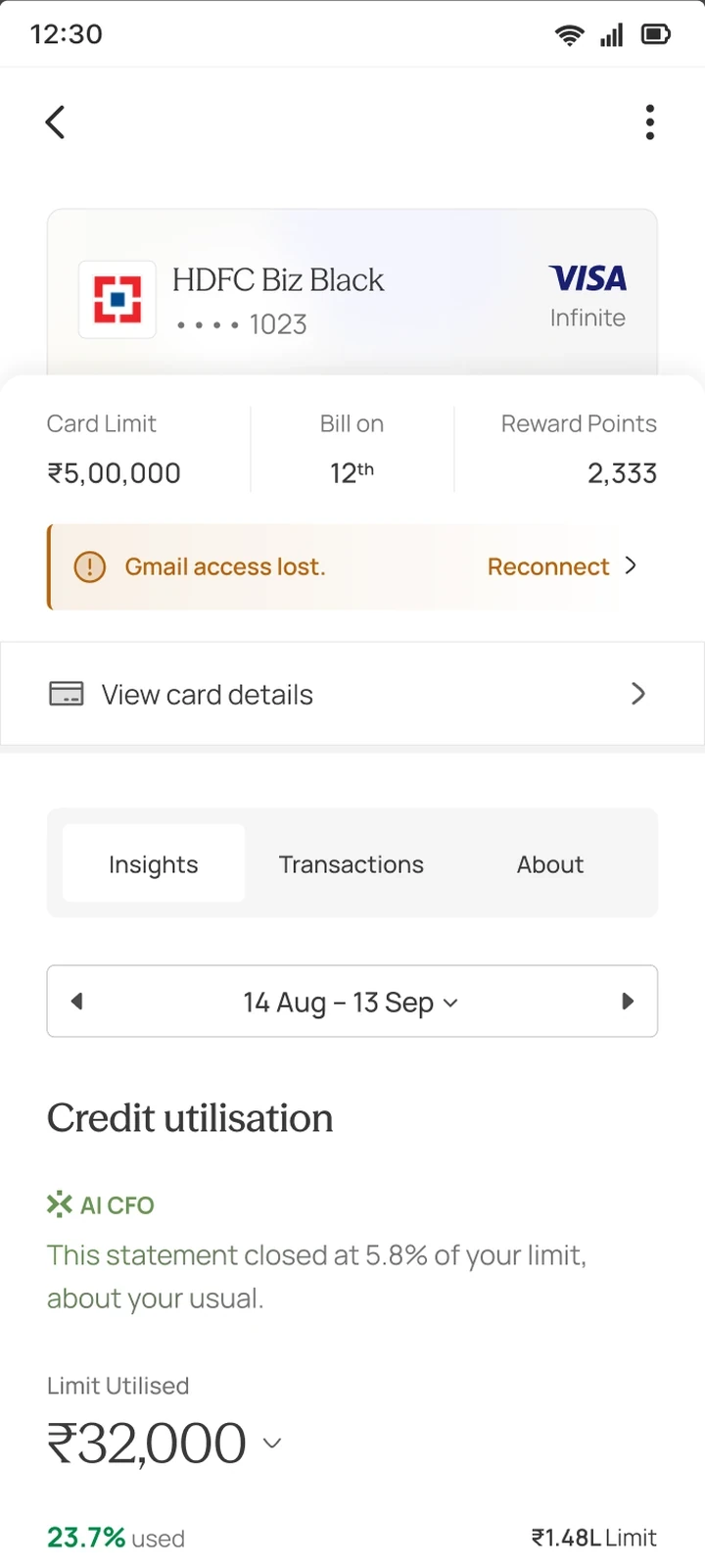
Email access lost, with Reconnect
01Email access lost

The last numbers stay, with their date, next to Reconnect.

Your statement is locked, with Add password
02Statement locked

We found it but can’t open it. One line says what to do.

Card details couldn’t load; other cards are still up to date
03Couldn’t load

Only this card failed, and the screen says the others are fine.

Wallet with an email disconnected banner
04Email disconnected

Old numbers stay in the wallet with their date, and Reconnect fixes every card on that inbox.

N°08 Looking backMeasures and open questions

How we’ll know it works, and what’s still open.

How we’ll know · set before internal testing

What has to hold before anyone outside the team sees it

Does it work?
Cards connected

the share of trackable cards that get connected, and cards added per person

Amounts right

due amounts match the real statement, every time we check

Is the flow too long?
Drop-off

where people leave between picking cards and tracking them

Declines

how often the inbox permission is refused, and whether Try again recovers it

Is it useful?
Return

people come back to the wallet, and open a card before its bill is due

Reminders

due reminders get opened, and Mark as paid gets used

Still open30% or 70%?

The guideline says warn at 30%. A review suggested 70%, so people aren’t warned too often. Still being decided.

Still openCards that share a limit

An add-on card can share one limit with the main card. The total has to count that limit once, not twice.

Still openWhen the numbers don’t add up

Outstanding and available don’t always match the limit, for example when an EMI holds part of it. The screen needs to say why.

What I learnedDesign for the data you’ll have, not the data you want

Email is always a little behind. Deciding early that every amount carries its date meant old numbers could stay on screen instead of turning into error screens.

Still in development: being built and tested internally.

Next case study
N°10 · Say hello

Let’s make something.

Have an interesting problem, an ambitious idea, or an interaction that refuses to behave? I'd love to hear about it.

Click the lake to send up a lantern
© 2026 Ishita BhoreOpen to product design rolesBengaluru · --:-- IST · Built in Framer

Create a free website with Framer, the website builder loved by startups, designers and agencies.